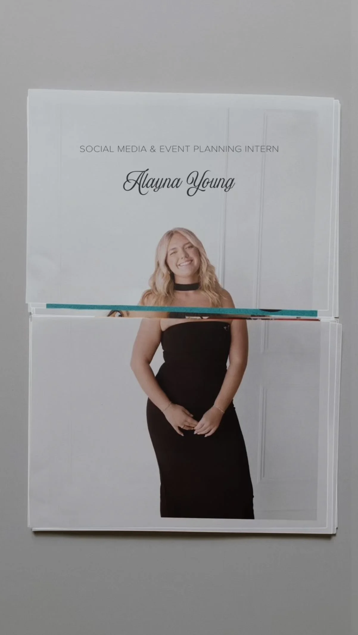
SOCIAL, BRAND IDENTITY, EVENT COORDINATION, STYLING

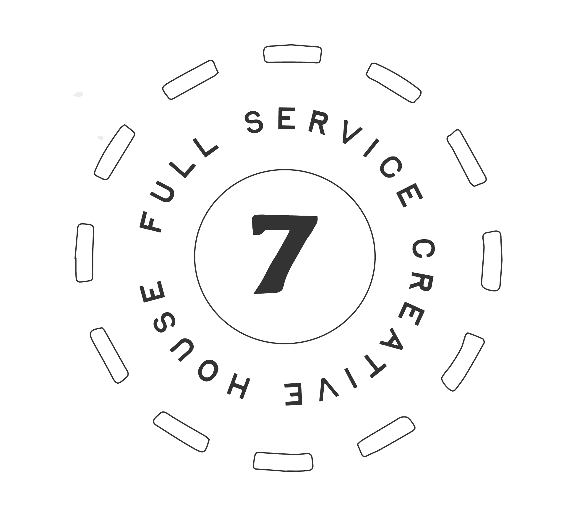
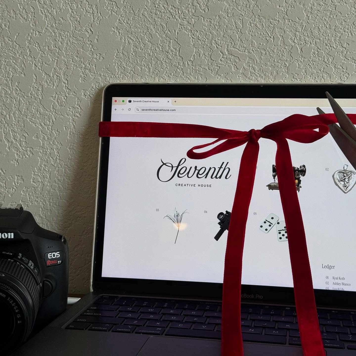
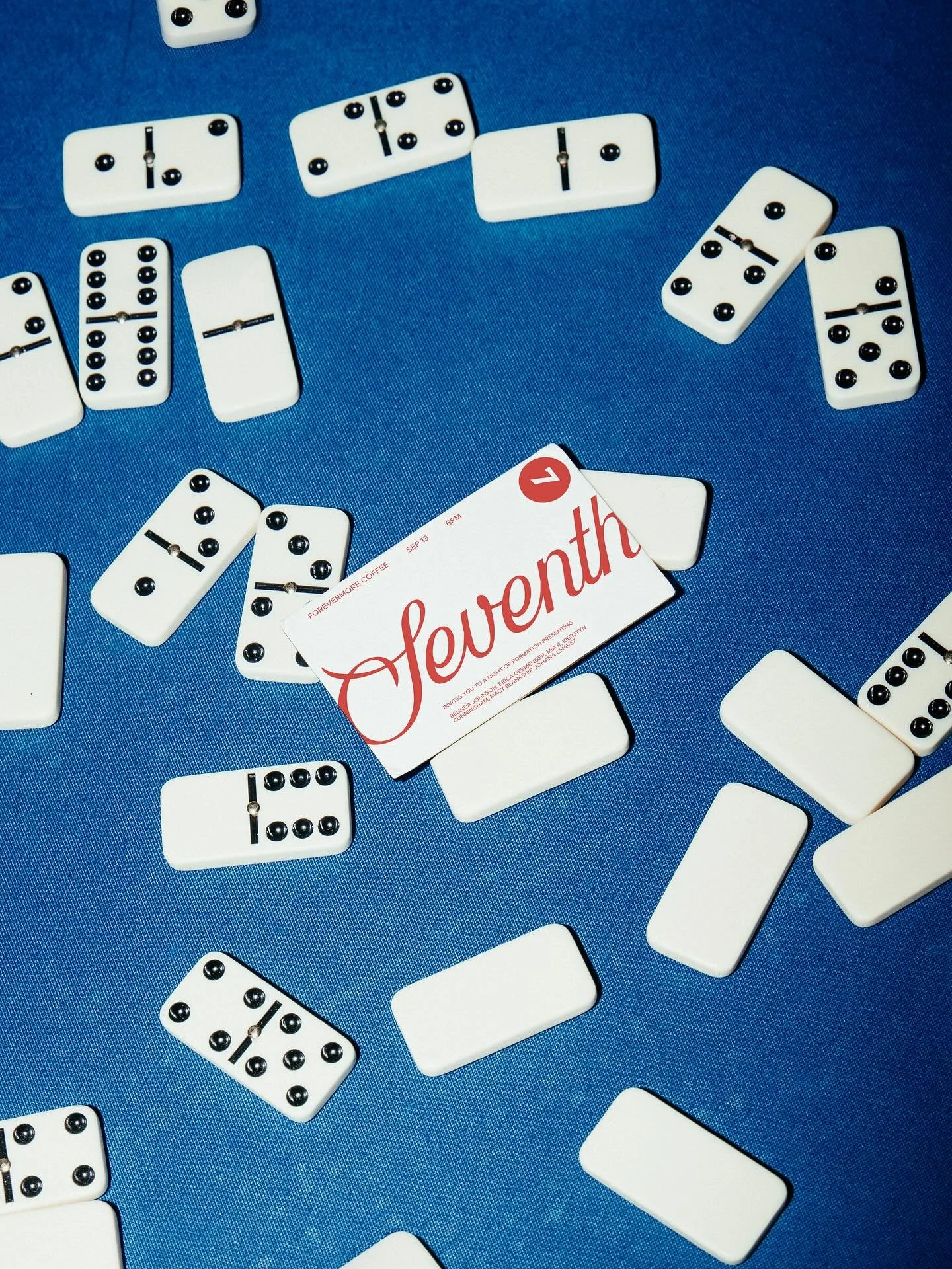
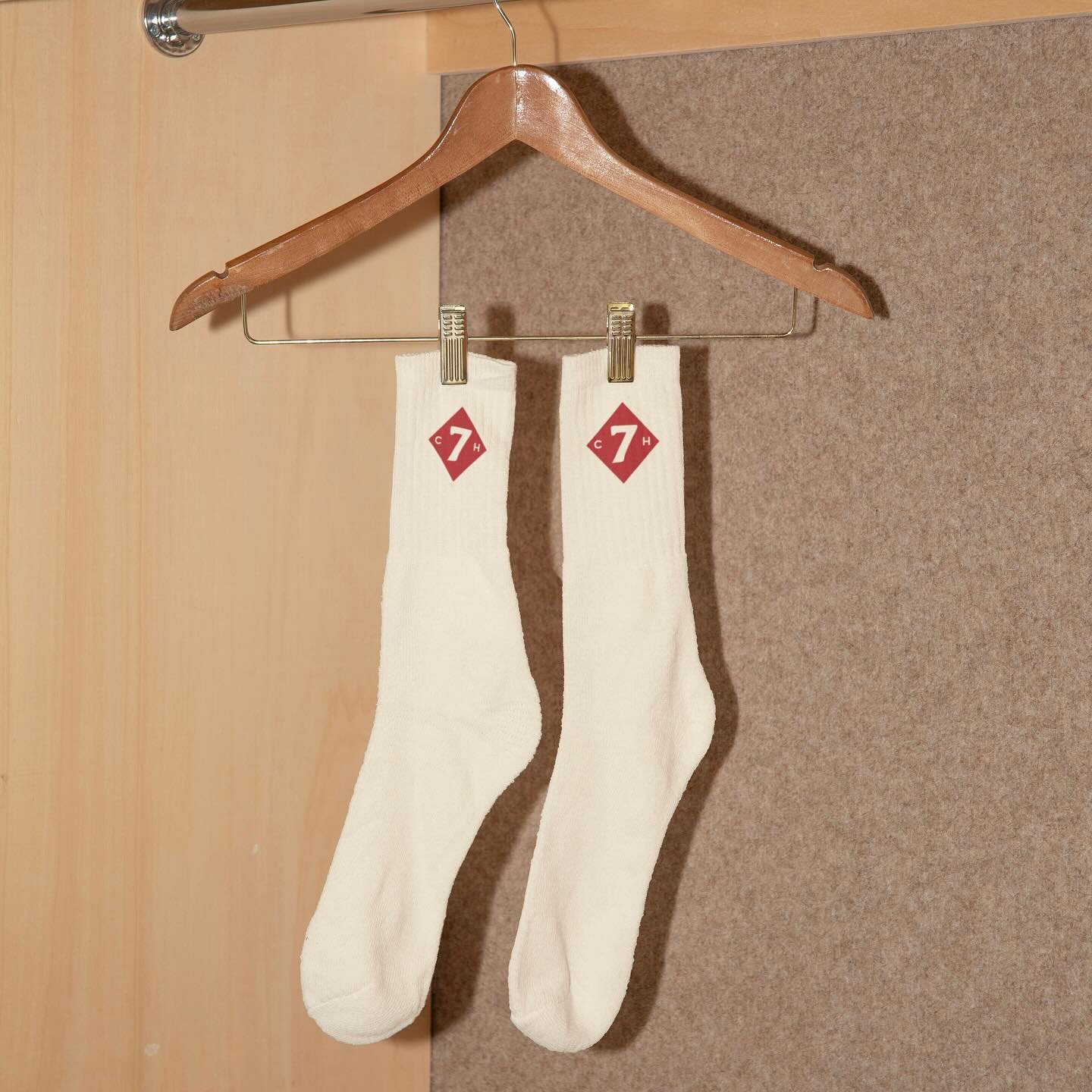
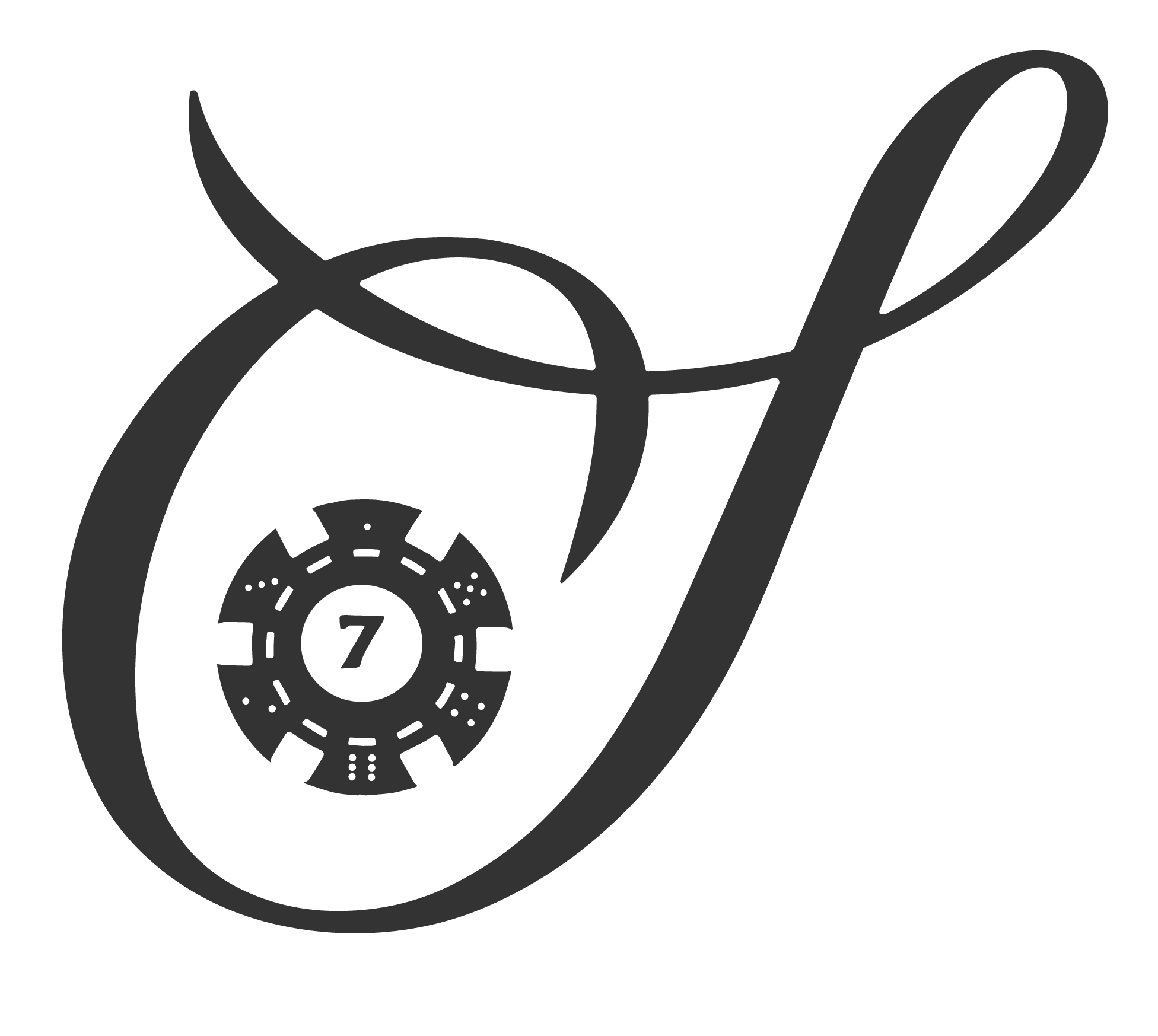
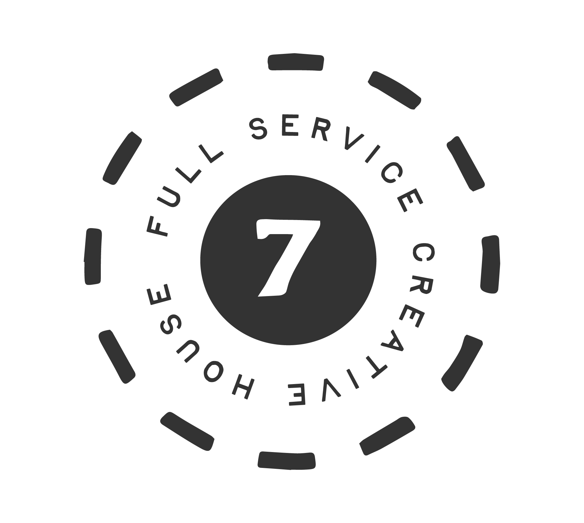
Seventh’s logo suite was designed to balance structure and flexibility. The primary mark anchors the brand, while secondary and supporting marks allow for variation across formats, layouts, and scale. This system ensures the brand can show up consistently without
The color palette was intentionally kept restrained and neutral-forward, allowing the work and storytelling to take precedence. Subtle contrast and depth were prioritized over trend-driven color, creating a palette that feels timeless and adaptable across digital and physical spaces.
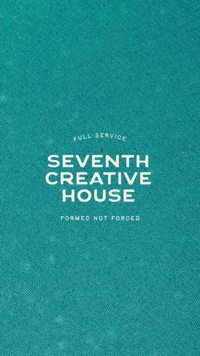
The typography pairs editorial influence with clarity. Serif elements introduce warmth and character, while clean supporting type keeps the system legible and modern. Together, they create a visual rhythm that feels confident, thoughtful, and distinctly Seventh.

Seventh’s brand voice was shaped to feel grounded, articulate, and human. Language choices prioritize clarity over cleverness and presence over performance, allowing the brand to communicate with confidence while remaining approachable and intentional across every touchpoint.
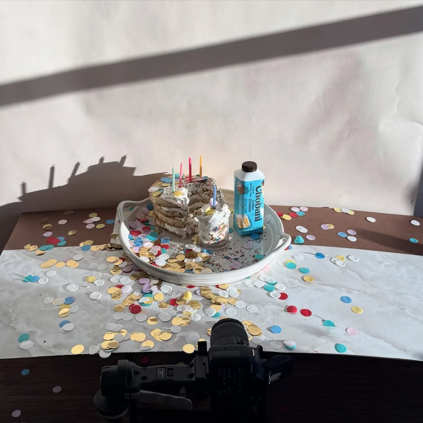
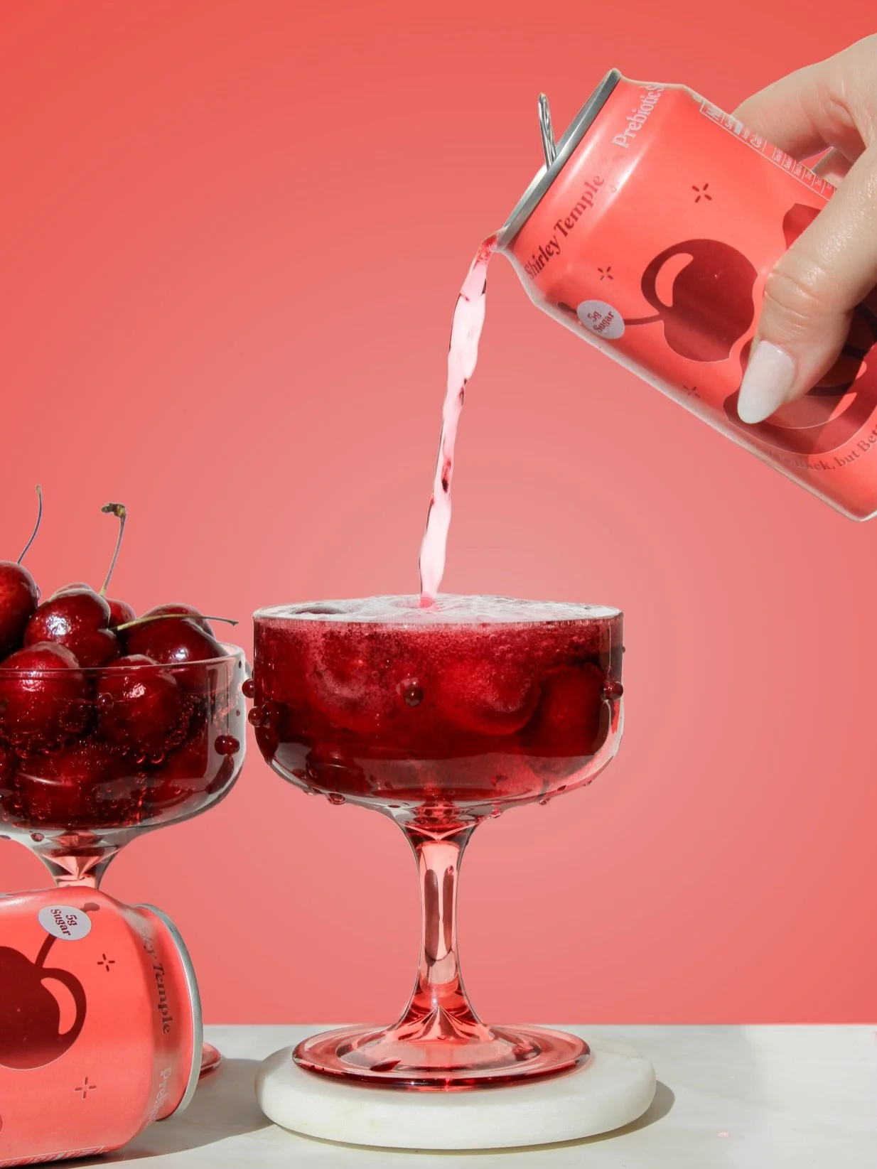
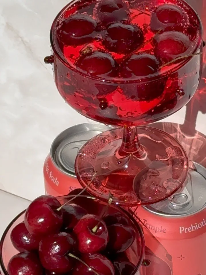
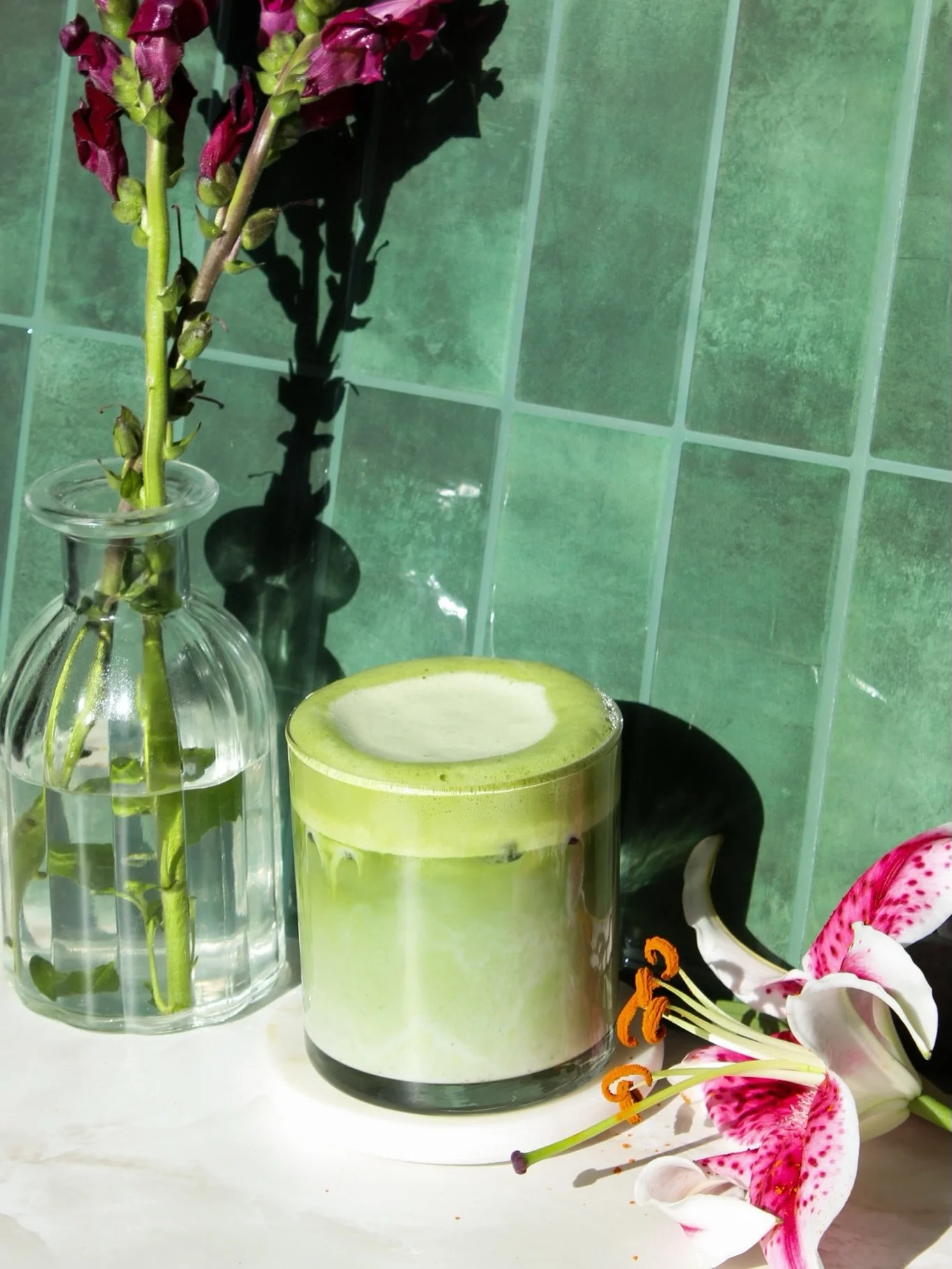
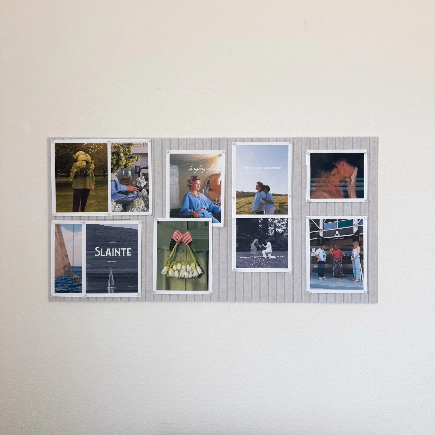
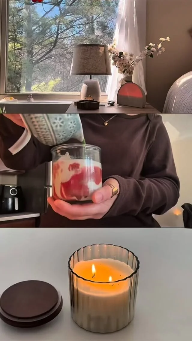
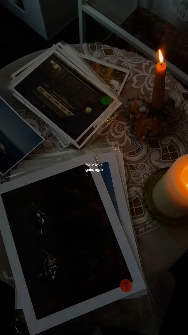
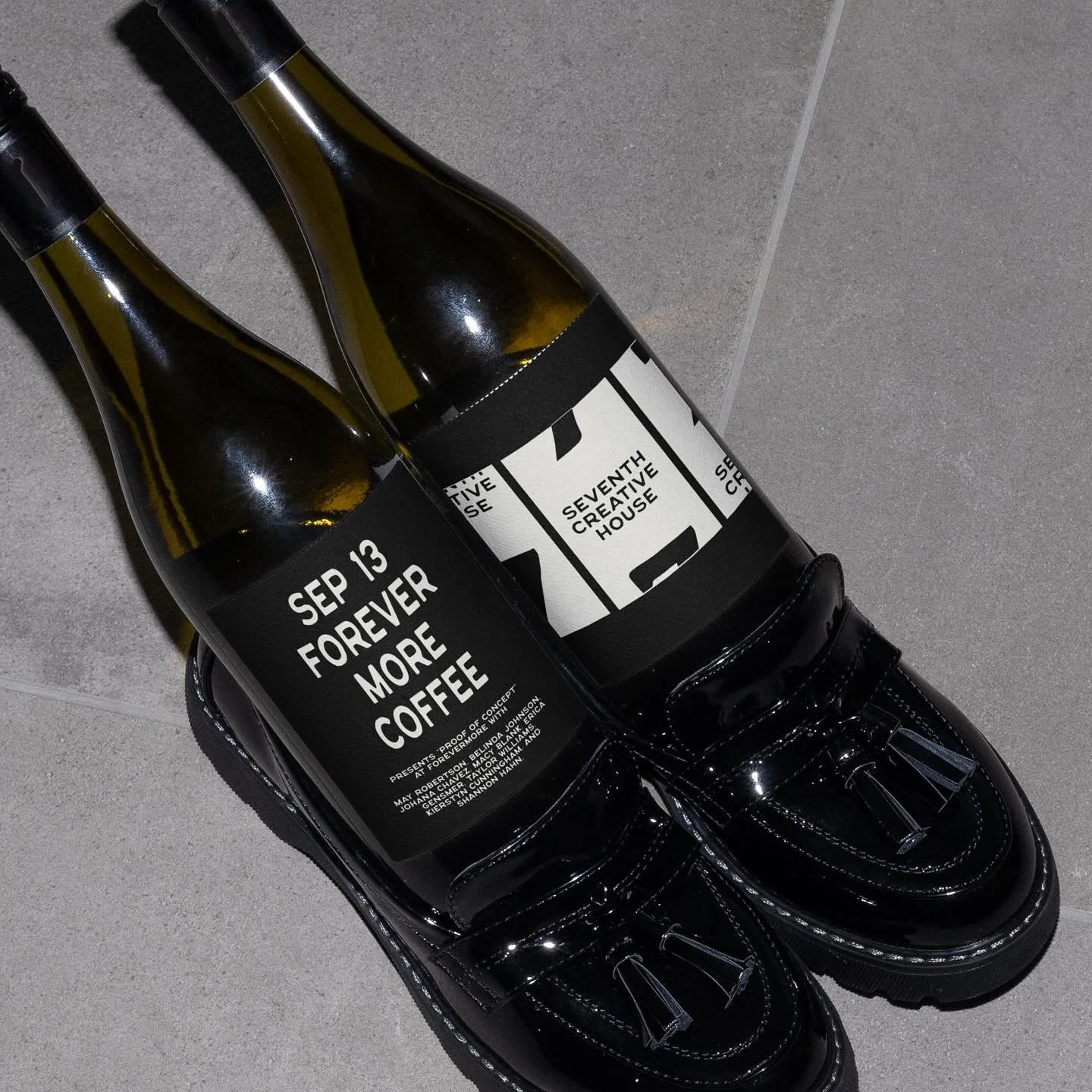
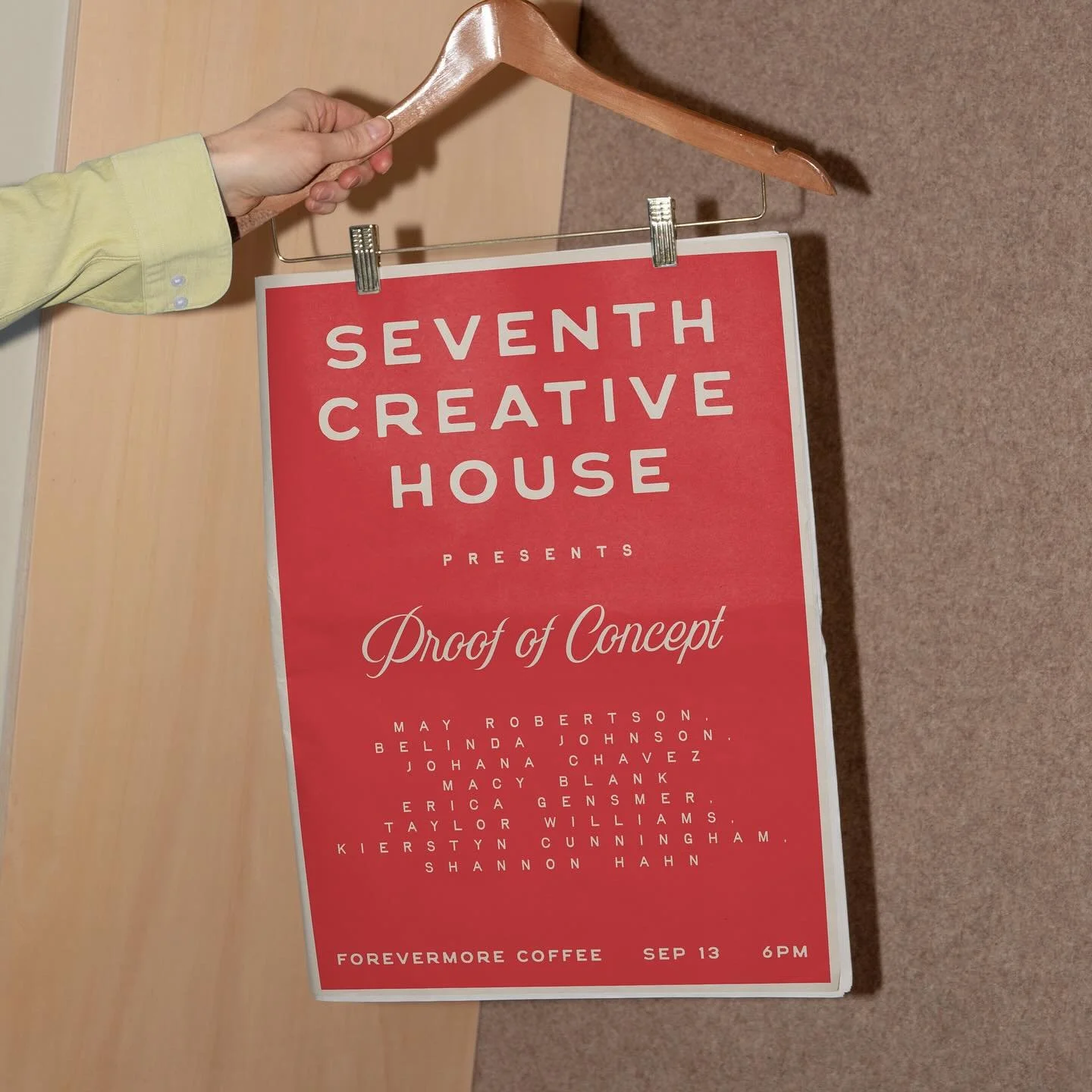
The imagery direction balances editorial polish with lived-in realism. Rather than overly styled or performative visuals, imagery is chosen to feel natural, textured, and observational — reinforcing a sense of presence, warmth, and authenticity that aligns with how the brand shows up in the world.